Healthslips
project overview
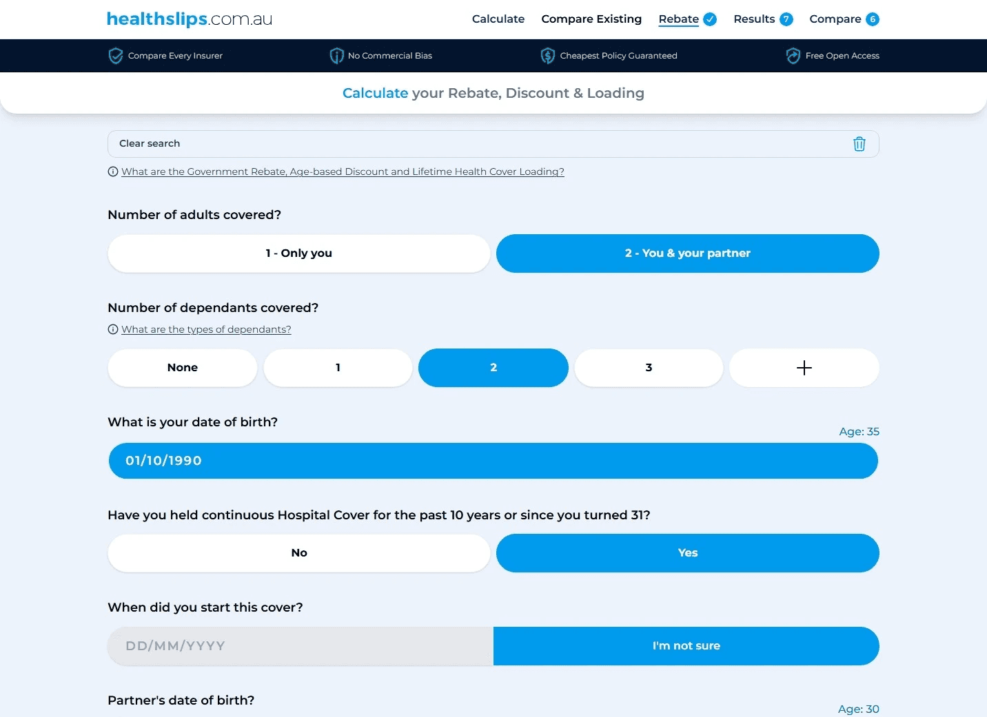
Healthslips is a new-to-market health insurance comparison calculator and marketing website. They needed to scale-up their offering and apply UX best practices, WCAG accessibility standards along with improving and consolidating their vast, and quickly aging design system in Figma.
project type
UX Research & Design
Health insurance comparison Web App Calculator + Website
year
2025
role
UX & UI Lead
client
Healthslips
The team —
CEO
1x COO / Product Owner
1x Product Lead UX/UI (Peter)
2x Engineers
The Problems & Opportunities —
Low end WCAG accessibility standards, upgrading to AA
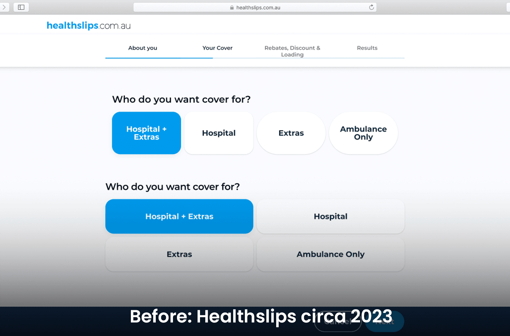
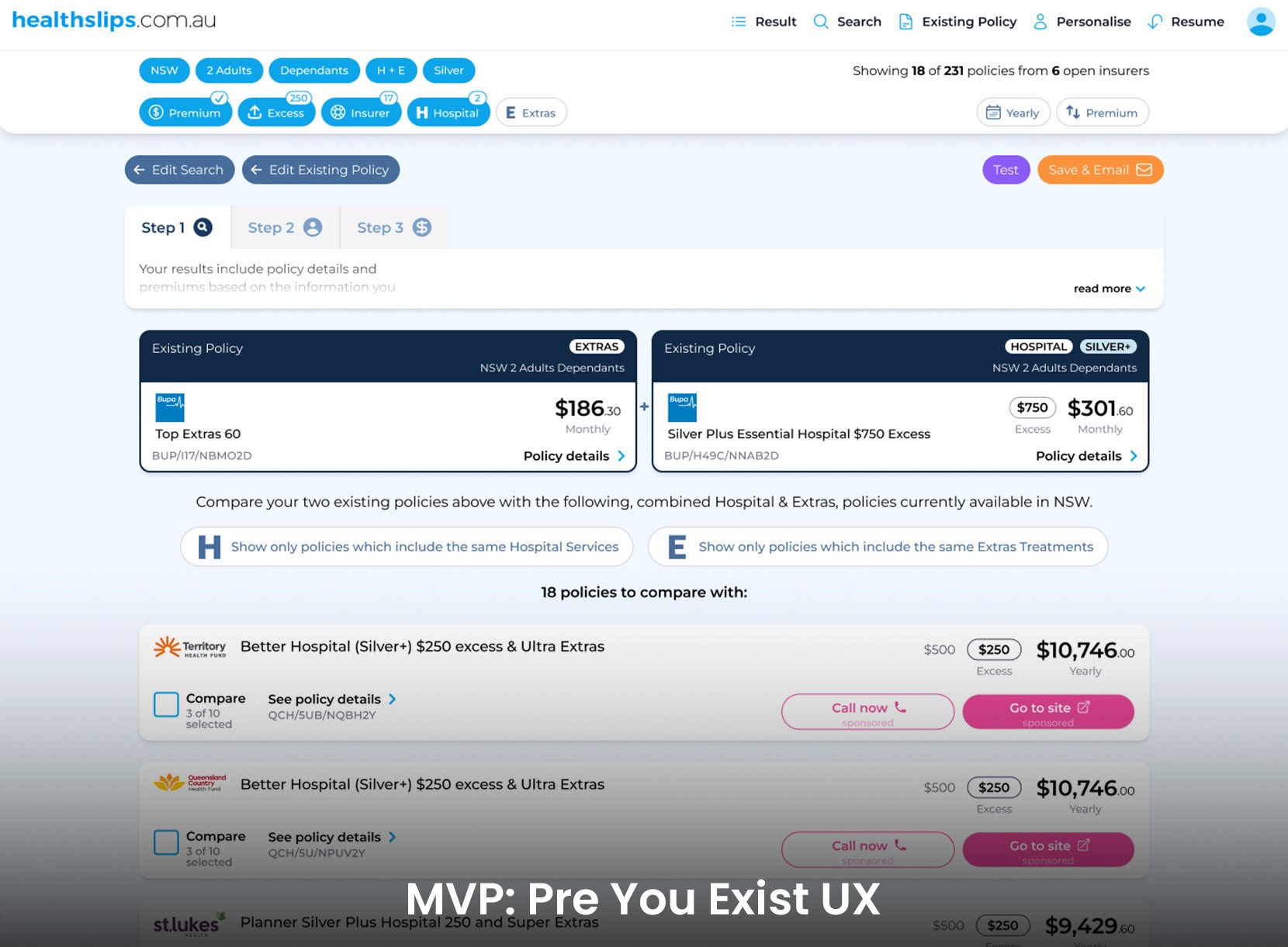
Dev led MVP prototype, required UI standards & implementation
Design system upgrade to tokens and advanced components
Dated single layer IA navigation
No personas or journeys
Approach —
Competitor landscape & heuristic evaluation
Prioritisation of insights & changes with stakeholders
7x 1-on-1 moderated usability tests & interviews
Insight synthesis and prioritisation from interview data
Perceived Usability & Trust Score - 75/100
Applying changes to design from insights
Briefing developers on UX / UI changes
3x Conversion Experiments and counting (ongoing)
Clarity recording insights applied
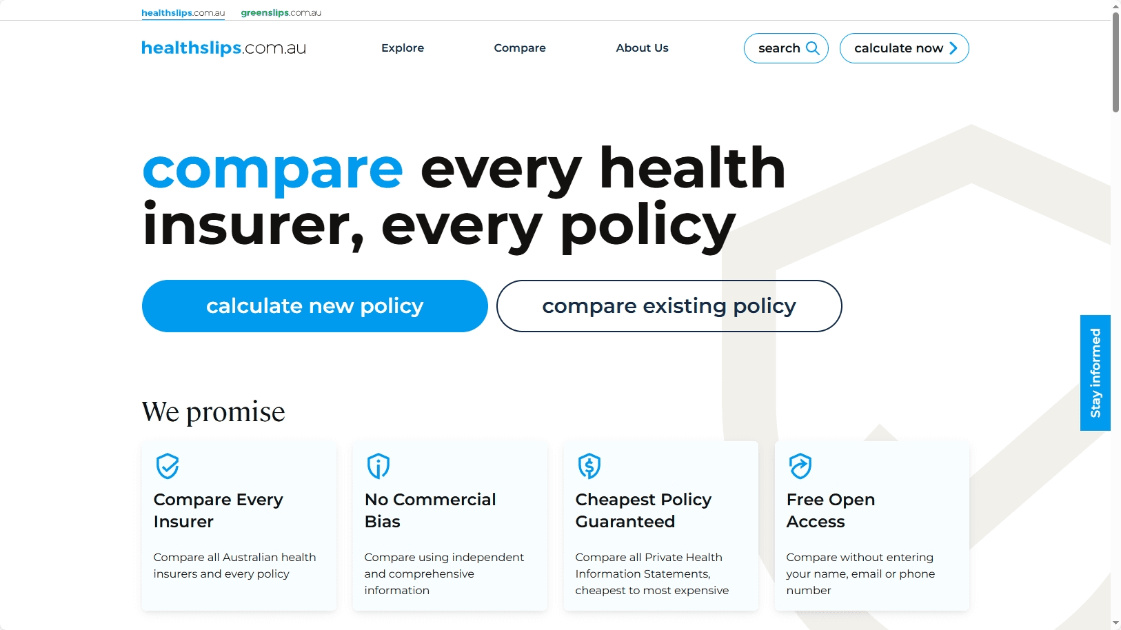
Mega menu IA strategy for website, design, prototype & development handover.
Variable-based design system creation and management for both the website and the calculator
Results —
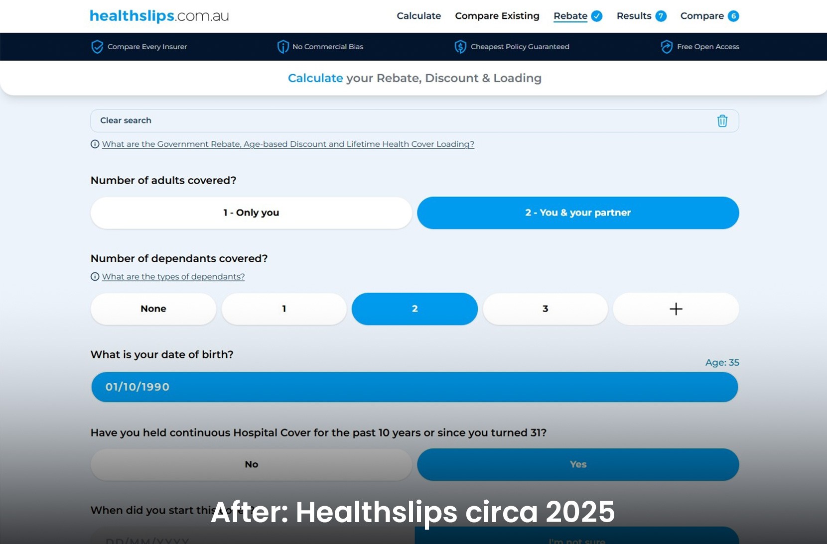
Overhauled the UX & UI of the dev led MVP product
Accessibility - WCAG 2.0 standards improved
Improved design / engineering efficiency with team
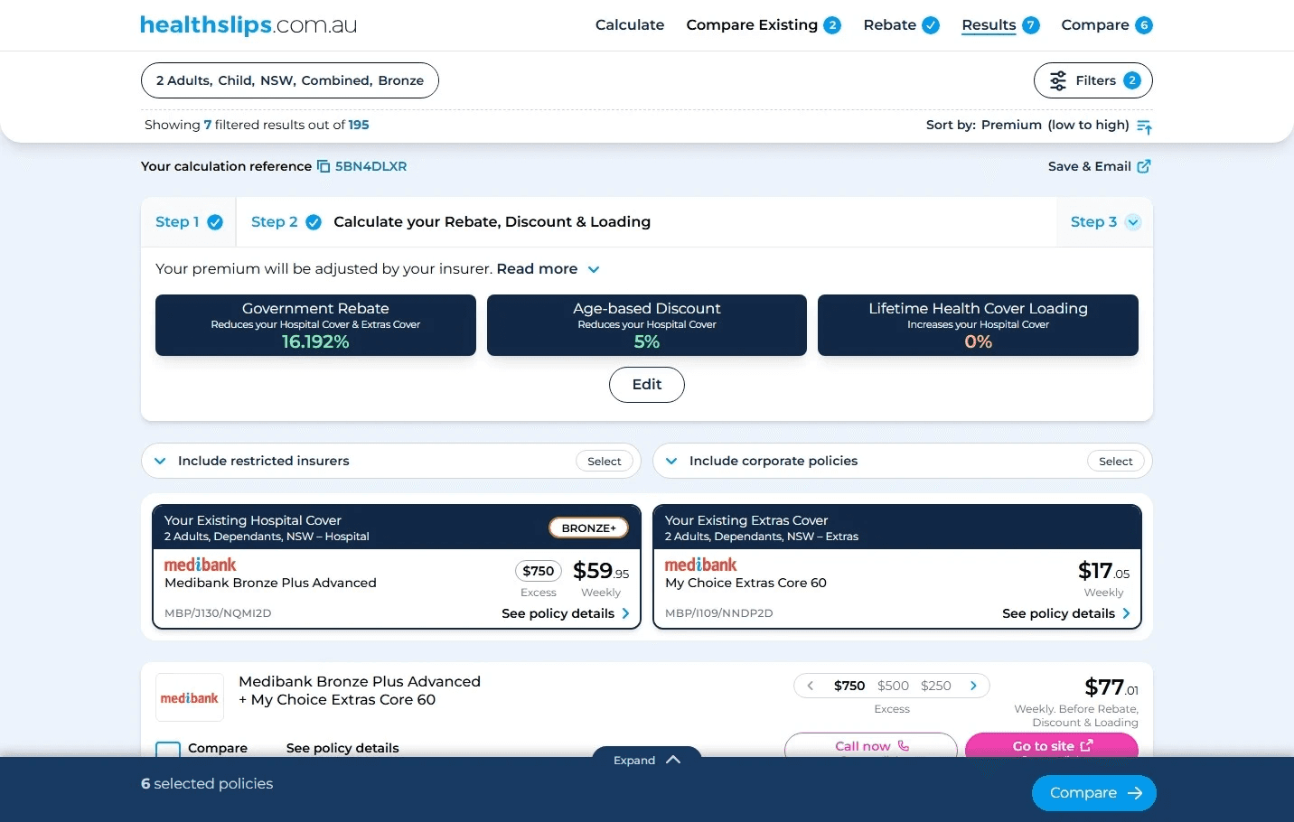
New navigation and filters bar for dev-led calculator 2.0
Improved many UX journeys & tools from testing & experiment insights
Navigation
Reducing jargon, introducing tool tips
Policy modify 'Extras Consolidation' feature
Policy details button placement
Filters bar overhaul
Save & email feature
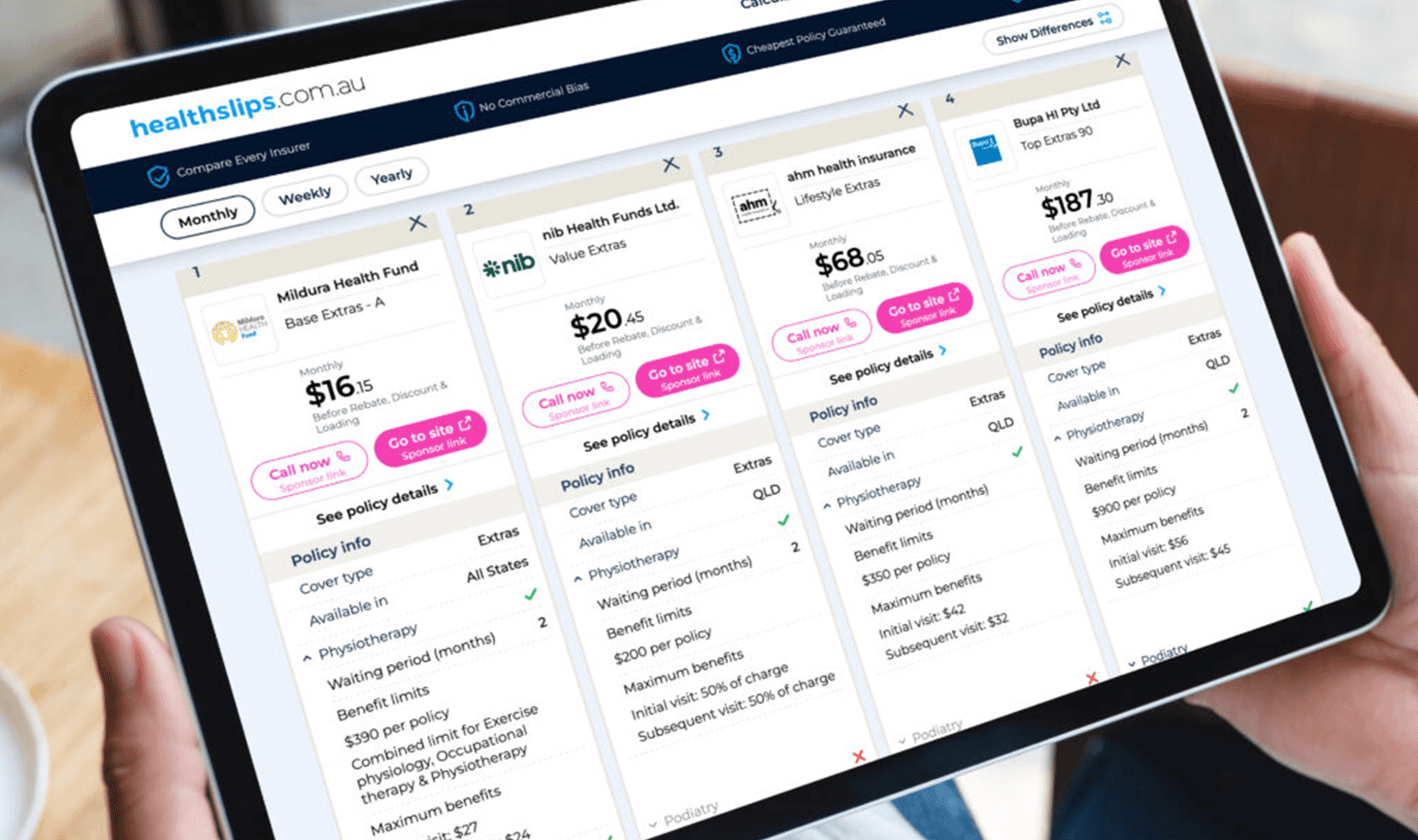
Existing policy compare
Perceived Usability & Trust Score - 88/100
BETA launch ready calculator (July 2026)