greenslips
project overview
Greenslips insurance calculator was behind on modern accessibility standards. Form abandonment was increasing and the UI was beginning to show its age, all this was affecting user trust & revenue.
project type
UX Research & Design
CTP Insurance Website & App Calculator
year
2024 - onwards
role
lead ux researcher & designer
client
greenslips
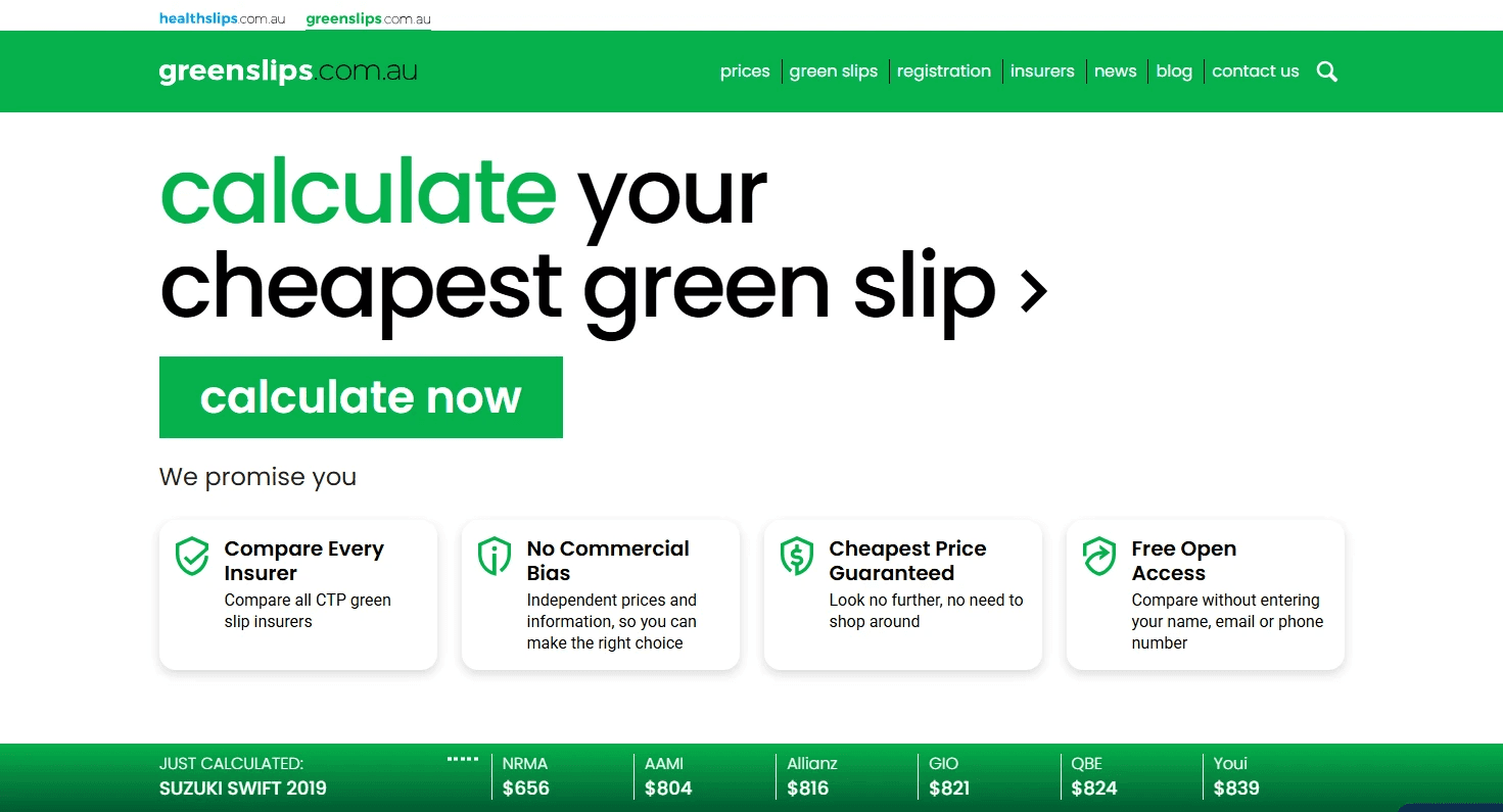
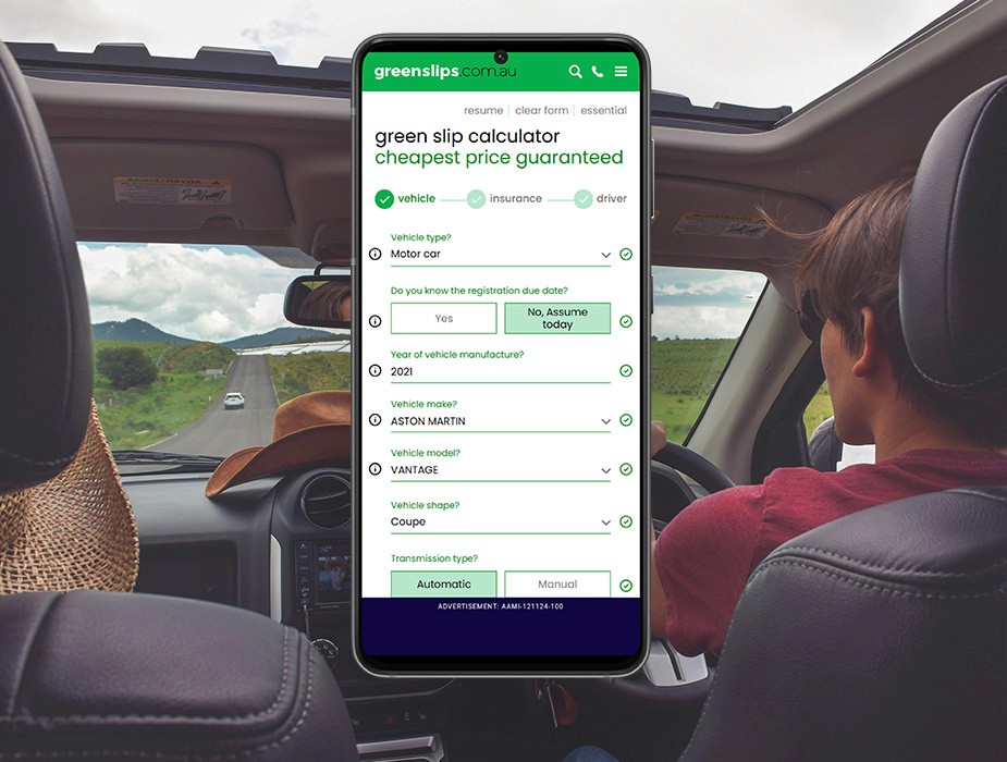
Greenslips is a mature and functional 25-year-old Australian company with a proven value proposition and revenue model, providing Australians with accurate price comparisons for CTP (compulsory third party) automotive insurance via a detailed online calculator form.
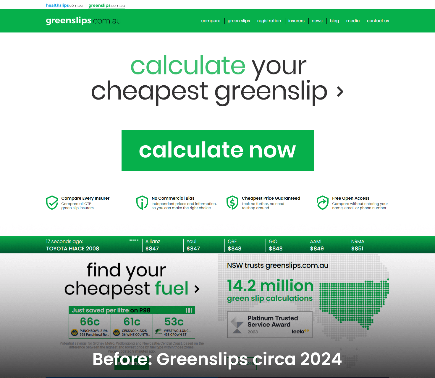
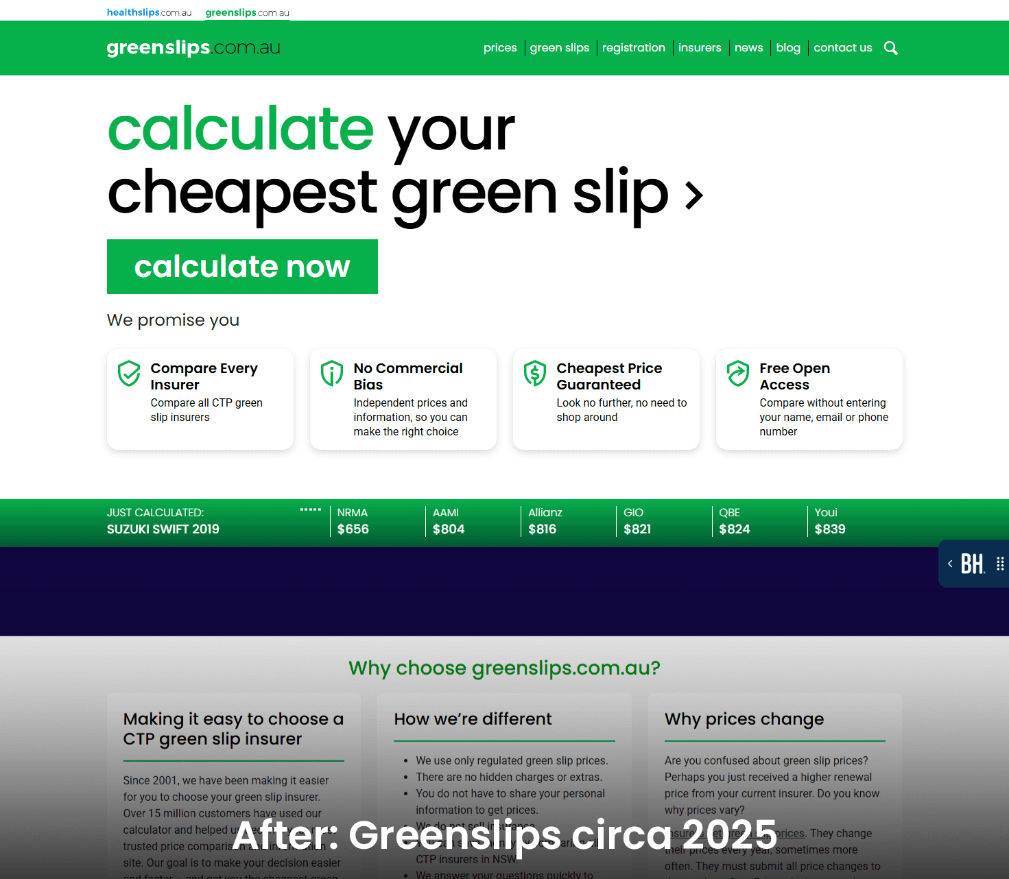
The Problems & Opportunities —
Being a proven revenue driving business, we needed to take care — our strategy was focussed around carefully released, data driven design decisions.
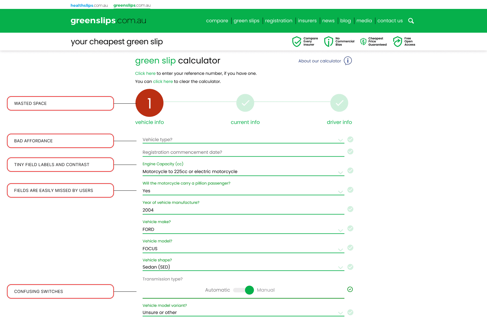
Below A rating - WCAG accessibility standards on a >30 questions calculator
Critical form abandonement rates
Many customer friction points identified in a high-volume journey
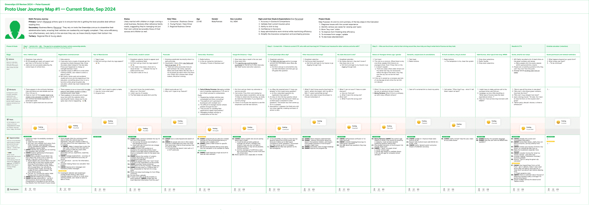
No user journeys
No design system or UI files
Loads of quant/qual data available for analysis
The team —
CEO
COO / Product Owner
Product Lead UX/UI (Peter)
2x Engineers
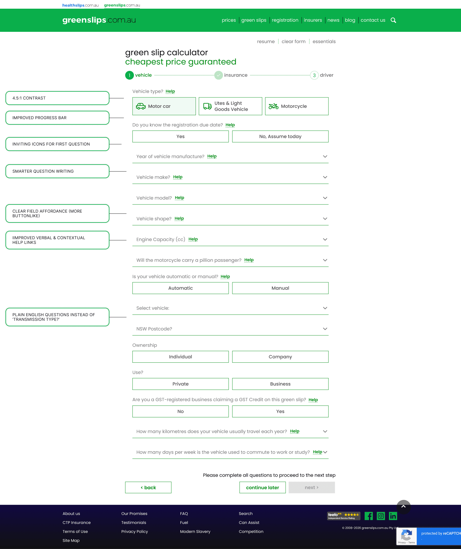
Being a developer-led product, there was no standardised Figma design system to guide designers or any design files for that matter. Many form questions were lacking plain English explanations and info tooltips.
Approach —
WCAG AA Audit and Prioritisation
Massive data analysis across varying touchpoints
Mapped abandonment data rates to specific questions for granular problem identification
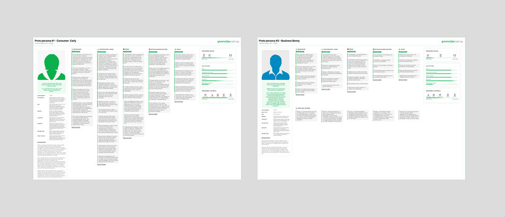
Created personas & journeys
Quant. review insight synthesis
Language & jargon audit
Heuristics & UX Audit
Optimised screen real estate & UI clarity
Gentle release approach to earn stakeholder trust
Results —
Sustained improvement of 8-12% on abandonment rate by tweaking several UI features
Quicker form completion times by several seconds
Reduced jargon & introducing plain english
Decreased question abandonment across the board
Moved from below A to AA accessibility ratings (WCAG 2.0 where possible)
Improved button affordance and colour contrasts
Fresh UI components, charts, buttons and more.
Improved design management with a comprehensive design system
Deliverables —
Competitor research & SWOT
Heuristic analysis
Analytics & Review Data analysis
Personas crafted from SME's and thousands of online reviews
User journey map
Insight & task prioritisation
Colour palette adjustment for Accessibility
Legacy Calculator Form design optimisation
Figma components & Design system creation and management
Handover to developers and QA monitoring
Post-launch data analysis